|
 |
|
|||
|
|
|||
|
27:
Text Design
|
27.4 Text Design for Readers with Special NeedsIn this section, I turn to consider issues of text design for two sets of readers with special needs: the elderly and the visually impaired. These two sets of people can, of course, overlap. 27.4. 1 Instructional Text and Older ReadersThe proportion of older people in society has gradually been increasing throughout the 20th century. Life expectancy at birth in the U.K. has increased by 50% in this century, and 4 in every 10 British adults are now over 50. In the United States, currently 12% of the population is 65 years of age or older, and the number of Americans over the age of 65 years is expected to double to 65 million by 2030. Thus people are living longer, and the number of elderly people in the community is getting larger. Consequently, there are more older people reading traditional texts, and more texts being produced especially for them. The research on the effects of aging can be described in terms of three overlapping areas: physiological, cognitive, and social. Physiological research looks at the biology of aging and its physiological correlates. Most people, for example, experience a sharp decline in eyesight. Cognitive research on aging focuses on changes in memory, learning, and judgment. Such effects have implications for work on text design. Social research on aging examines how, for example, societies expect their older members to function. Studies of "ageism," for example, focus on how commonly held attitudes and beliefs about what old people should and should not do determine to a considerable extent what, in fact, they do do. It is difficult to summarize in a few lines the main findings of studies of aging and their implications for text design. (Fuller expositions can be found in Birren & Schaie, 1990, or Craik & Salthouse, 1992.) Here, for the sake of argument, I would like to suggest two main points that I think it is helpful to bear in mind when thinking about these issues. These are:
Studies of memory for text suggest that a number of possibilities can occur (Meyer et al., 1989). Evidence has been provided in different studies indicating that older people:
These different outcomes may result from different investigators focusing on different issues in their studies. The findings suggest that older people may not have much difficulty reading or working with text that is relatively simple (in terms of its typography) or familiar to diem. However, text that is typographically complex and which deals with unfamiliar material (like how to operate a video recorder) may cause middle-aged and older people considerable problems. Thus, one might not expect differences between older and younger readers when the verbal ability of the readers is high, when they have good prior knowledge, and when the texts are well presented. However, as Meyer et al. (1989) suggest, differences might well be. expected to emerge with less-able readers, less-familiar materials, and poorly designed text. 27.4.1.1. Improving Typographically Simple Layouts. Generally speaking, the literature reviewed above suggests that text will be easier for older people to use if their perceptual and memory-processing loads are reduced. I would want to argue that this can be achieved by, for example:
Unfortunately, there are insufficient studies in this area to support or reject these hypotheses. In a separate review (Hartley, 1994b), I have summarized the results from some 16 studies that examined varied aspects of text design with older participants. These studies used what I called relatively simple typographic layouts: mainly continuous run-on prose. Table 27-1 shows how, except for the area of type size, there are insufficient studies for anyone to make any clear generalizations from their findings.
However, all five studies on type size did suggest that larger type sizes were more suitable for older readers. It appears that-ignoring my earlier caveats about measuring type sizes-that 12- or 14-point type seems more appropriate for older readers. The two studies with unjustified text suggested that there were advantages for unjustified text with less-able older readers when the line lengths were short (seven to eight words). The two studies on underlining and the two on advanced organizers had mixed results: one positive and one neutral in each case. The two studies on improving readability showed that this had no effect with age. However, there were age effects for the studies with questions, signals, and variations in text structure: Older readers did less well than younger ones, but high-ability readers were helped by the textual variable being considered. My review highlighted three issues in this research:
27.4.1.2. Typographically Complex Texts. So far I have discussed research with older readers and texts that have had a relatively simple typographic structure. I now turn to consider more complex materials. These include, for example, bus and train schedules, labels on medicine bottles, food packaging, and government forms. Regrettably, there are very few studies in this context. Six studies that I did find suggested, as noted earlier, that more complex text presents greater difficulties for older readers. These studies involved readers completing income tax forms (James, Lewis & Allinson, 1987), following diagrams (Lipman & Caplan, 1992), using an analogous model (Caplan & Schooler, 1990), reading prescription information (Mon-ell, Poon & Park, 1990), following instructions for completing assembly-type tasks (Morrell & Park, 1993), and using flowcharts to aid decision making (Michael, 1988). In these studies, the younger participants always did better than the older ones, and the devices used to aid the readers here proved more helpful for the younger readers than for the older ones in the studies by Caplan and Schooler (1990), Lipman and Caplan (1992), Morrell and Park (1993), and Michael (1988). Indeed, I drew the tentative conclusion in my review that devices used to help readers in these situations actually hindered older readers. Clearly, more work needs to be done in this area of instructional design. One useful suggestion that did emerge from these papers was that it might be wise to ensure that older people are included in initial evaluation studies of textual materials. It can be argued that designing a text for an older reader may not confuse a younger one. However, designing a text for a younger reader may confuse an older one.
27.4.2 Text Design for the Visually Impaired During 1986/87, the U.K. Royal National Institute for the Blind (the RNIB) conducted a survey of the needs of blind and partially sighted adults in Britain, and a final report was published in 1991 (Bruce et al., 1991). A similar report on the needs of blind and partially sighted children was published in 1992 (Walker et al., 1992). And although these reports describe the situation in the U.K., we can anticipate that the problems are similar in other developed countries and worse in developing ones. The 1991 U.K. report indicated that there were approaching I million (960,000) blind and partially sighted adults in Great Britain, many more than those actually registered (239,000). The prevalence rates (for those registered) were as follows:
Thus, one person in seven aged 75 or over was blind or partially sighted, and this prevalence rate was almost certainly higher among those over 80 and those over 85. It is, of course, important to realize that the great majority of these people are not completely blind but are, in fact, partially sighted. The RNIB 1991 report estimated that only 20% of "blind" people are completely blind (and this number includes people who can perceive light but nothing more). Thus, 80% of the blind have varying degrees of visual impairment, and, as we shall see below, many can read large print. Similar findings were presented in the 1992 report on blind and partially sighted children. It was estimated that there were at least 10,000 children in Great Britain with significant visual impairments, and possibly as many as 25,000. As many as 80% of the children in the sample were reported to have had their sight problem from birth. For some children (and adults for that matter), spectacles, contact lenses, and other magnifying devices mean that they can in fact read and write using print rather than Braille. In this children's sample:
The RNIB reports point out that the needs of blind and partially sighted are complex. Many of them have additional disabilities, and many cannot use Braille or computers because of additional learning or physical difficulties. 27.4.2.1. Large Print. The RNIB considers that 10-Point type (as used in this handbook) is too small for many readers, not just the blind and partially sighted. They recommend 12-point type for most documents and 14 point as the minimum type size for material intended for the blind and partially sighted. Other recommendations are given in Figure 27- 10. Similar guidelines have been produced in the United States by the American Association of Retired Persons (1986) and by the Civil Rights Division of the U.S. Department of Justice (1988). These guidelines share some common characteristics: They make good sense but occasionally imply too strongly that they are based on known research findings. It is important to remember, as noted earlier, that with large print the width of the text expands, as well as the depth. This may make it difficult to perceive the syntactical groupings of words if the page size stays the same. So, simply enlarging a text may not always be a sensible solution to the problem: One might take the opportunity to reconsider its design (see Hartley, 1994a).
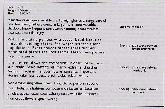
There have been few actual studies of designing printed texts for the partially sighted. Those that have been carried out have mainly been concerned with the setting of children's reading books rather than with material for adults. Shaw (1969) provides a good review of the earlier literature and reports on a detailed study with adults. Shaw asked her participants to read aloud short passages that varied in typefaces (Gill & Plantin), type sizes (from 10 point to 24 point), weight (bold and medium), and various spatial settings (see Fig. 27-11). Shaw reported that an increase in type size achieved a 16% improvement in reading performance, an increase in weight 9%, and a change from Plantin (a serif face) to Gill Sans (a sans-serif face) a 4% improvement. (This typeface change was particularly helpful for readers over 50 years of age.) These results must, of course, be considered with caution in view of the fact that the participants were asked to read the texts out loud and that the texts themselves, as shown in Figure 27-11, were very odd.
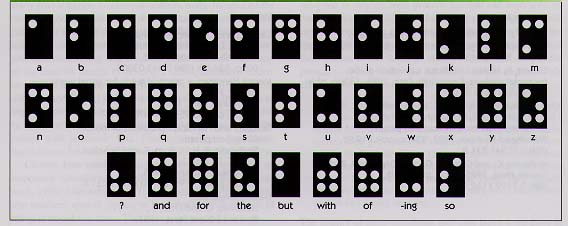
27.4.3 Presenting Text in BrailleThe Braille system-in which each character is conveyed by one of six embossed dots in a 2 X 3 matrix-is well known to many and is illustrated in Figure 27-12. Brailletext was originally produced on thick card, but today it is more likely to be produced by a thermoform system with heated, paper-thin, plastic sheets. This system also allows one to produce tactile maps and line drawings.
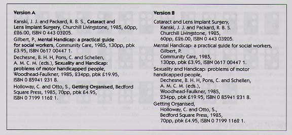
To the sighted reader, a page of Braille may look like a large and cumbersome equivalent of a piece of conventionally printed text. But this would be naive. Completely blind readers cannot see the top and the bottom of the page simultaneously; they have to work out which is which. They cannot see headings and subheadings at a glance. They cannot see at a glance how many paragraphs there are on the page, and thus how dense the text is. They cannot tell until they start whether the language of the text is going to be easy or difficult. To discover what is there, blind readers must start at the beginning and work through to the end without knowing (for the most part) when the end is coming. In this chapter, I have described how instructional text can be improved by paying attention to the typographic layout, to the wording or language of the text, and to the use of headings, summaries, numbering systems, and other such devices. Much of the research I have described would seem applicable to the setting of Braille text. Despite the fact that many Braille texts seem to be devoid of clear spatial cues-perhaps because of the assumption that there is no need to include space because blind people cannot see it-it would seem to me that the structure of Braille texts could be clarified by the methods discussed above. My observations of skilled Braille readers indicate that they can indeed "look ahead" by quickly scanning (with both forefingers), and that they welcome devices such as headings (Hartley, 1989). Blind readers require practical information (e.g., telling them how long an article is going to be) and contextual information (e.g., the use of overview summaries). If headings are numbered and phrased in the form of questions (e.g., who, what, when, where, why, how), then blind and visually impaired readers can read with such questions in mind, and they will know when they have reached the end of particular sections. Overview summaries and headings enable readers to "look ahead" more easily and thus to reduce their memory load while reading. In addition, it might also be profitable to think of how one can convey information differently without the array of "graphical devices available in printed text. In Figure 27-13, for instance, I contrast the traditional sequence used in presenting references in a scientific journal with what might be appropriate in a Braille version. In Version A-the traditional setting-the text is continuous, and different sections of the references are denoted by different typographic cues. In Braille versions of this material, it is conventional to follow this continuous sequence of the printed version. In Version B, however, I have shown how by resequencing the elements, and by placing the key elements on different lines, the text is easier to search, even though it has no typographic cues. Clearly making changes such as these may be costly in terms of the additional space required, but such changes may be more cost effective if readers find the resulting text easier to read.
At present, of course, we do not know whether respacing traditional Braille settings would be of value to blind readers: It May make little difference to those blind from birth. However, it is likely that those who become blind in later life and who wish to learn to read Braille do carry with them a repertoire of expectations about text layout that is currently not realized in Braille. |
||||||||||||||||||||||
|
|
|
|
AECT 877.677.AECT
(toll-free) |
|