|
 |
|
|||
|
|
|||
|
27:
Text Design
|
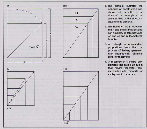
27.1 Some Typographical Considerations27.1.1 Page SizesPrinted materials come in many shapes and sizes. There are no specific rules or guidelines that might suggest to writers, designers, or printers why they should choose one page size in preference to any other. The research literature on legibility and textbook design offers little help, for page size is not an issue that features in many books on text design. Why then do I choose to start this chapter by discussing page sizes? Many people expect a chapter on textbook design to begin with issues such as type sizes, typefaces, and line lengths. However, it is important to realize that the choices for these variables are already constrained by earlier decisions. Clearly, we do not expect to find large type sizes in a pocket dictionary or a single column of print in a daily newspaper. These examples are extreme, but they illustrate the point. The choice of page size comes first, and this affects the choices that are available for subsequent decisions. The size of the page (and, these days, the electronic screen) determines the size of the overall visual display. The reader needs to be able to scan, read, and focus on both the gross and the fine details of this display (see 16.11). The size of the page (or screen) constrains the decisions that writers and designers make about these details. The choice of an appropriate page size is not always easy. A number of factors contribute to decisions about which size to employ. Perhaps the most important one is some knowledge of how the information is going to be used. Others are reader preferences, the costs of production and marketing, basic paper sheet sizes, and, more generally, the need to conserve resources and avoid waste (Hartley, 1994a; Spencer, 1969). 27.1.2 Standard Page SizesThe page sizes that we commonly see are cut from much larger basic sheets that have been folded several times. The present-day variety in page sizes results from the manufacturers using different sizes for their basic printing sheets and folding them in different ways. If the basic printing sheets were all one standard size, however, and the method of folding them allowed for little if any wastage at the cutting stage, then great economies could be achieved. The need to rationalize paper sizes has long been discussed in the history
of information printing. In 1798, for example, the French government prescribed
a standard for official documents based on the proportion of widdl:height
as 1:1.41, with a basic printing sheet of I square meter in area. In 1911,
Wilhelm Oswald proposed the ratio 1:1.414 (that is, The dimensions of the sizes in the ISO A series are set out below. In the United Kingdom, the A series is used widely, especially the A4 and A5 sizes.
The unifying principle of the ISO-recommended range of sizes is that
a rectangle with sides in the ratio of
As the pages of a book are made by folding the larger basic printing
sheet in half — once, twice, three times, or more — all the
pages made from a standard-size basic sheet will be in the ratio of We may note at this point, of course, that documents can be arranged in a vertical (portrait) or horizontal (landscape) style and bound at the top (notebook style) or on the left. These variations allow for a variety of page layouts (see Fig. 27-2).
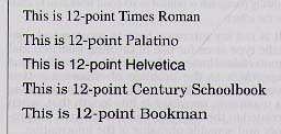
It is considerations such as these that come first when designing instructional text. When these decisions have been made (but not necessarily finalized), the designer can begin to think more about the details of typography. The next step is to consider the widths of the columns and the margins. 27.1.3 MarginsIn many books, the margins appear to be planned like a picture frame around a rectangle of print. Tinker (1965) reported that the space devoted to margins in this way could sometimes occupy as much as 50% of the page. However, if we take a functional approach rather than an aesthetic one, it seems to be fairly well agreed that a margin of about 10 mm is necessary at the top and the bottom of the page. However, the inner or binding edge margin is a special case. Here, thought needs to be given to factors that suggest the need for a wider margin. For example, the printed page may be copied at some time and the copies punched for filing with other material. The binding system itself may involve the punching of pages, or it may be of the kind that causes some part of the edge of the page to be hidden from view. Indeed, the binding system may be such that text or diagrams printed too close to the binding edge may curve inwards and be difficult to read. So, since text appears on both the front and the back of the page, a margin of about 25 mm. is usually necessary for both the left- and the right-hand margins. 27.1.4 Column WidthsThe choice of column widths also depends on the size of the page, the widths of the margins, and the nature of the text. For printed text, it is normal to consider one, two, or even three columns of print (depending on the page size). A decision to use three columns of print may be appropriate for text that is not very complex (typographically speaking). Other variations, such as one wide column and one narrow one, are possible with larger page sizes, and this is sometimes useful to consider when planning the size and positioning of illustrative materials (see Misanchuk, 1992, for a fuller discussion). 27.1.5 Type SizesSeveral researchers have made suggestions concerning appropriate type sizes for reading matter and have given advice on related issues such as line length and line spacing. Tinker (1963, 1965) and Watts and Nisbet (1974) provide good summaries of the earlier literature in this respect, and Black (1990) provides a more up-to-date account. Unfortunately much of the early research was not very helpful to designers of instructional text. This was principally because the variables such as type size, line length, and interline space were not studied in the "real-life' context of instructional material. Most early researchers, for example, considered issues of type size with short, simple settings of continuous prose (e.g., see Paterson & Tinker, 1929). Furthermore, the generalizations that emerged from this research did not take -into account the difficulties that arose from the fact that different typefaces with the same designated type sizes do not, in fact, look the same. There are many different measurement systems used in the printing industry, but, with the advent of desktop publishing, these will undoubtedly be rationalized. One measure that is likely to remain, however, is that of the "point." (A point measures 0.0138 inches.) Typical type sizes in textbooks are 10, 11, and 12 point. The "small print' (in legal documents, for example) may be 6 or 8 point, but this is too small for most people to read with ease. Larger sizes (such as 14, 18, and 24 point) are used for headings and display purposes. In this tm the typographic setting of the text is 10 point on 12 point This indicates that there is an extra space of 2 points between the lines of print to facilitate reading. The main text headings are set in I I-point bold, and the chapter headings in 22-point bold. However, as noted above, a confusing aspect of past research in this field has been the tendency to recommend the use of specific type sizes without proper regard for the fact that the specified size of a particular typeface (say 12 point) does not refer to the size of the image of the printed characters as seen by the reader. The specified size refers instead to the original depth of space that was required by a line of metal type when it was set with minimum line-to-line spacing. Letters were originally carved on the top of the metal shanks that took up this space. Consequently, the size and style of the letters on top of a shank could vary, although the measure of the shank always remained the same. Figure 27-3, for instance, shows the same sentence printed in one size of type but in five different typefaces. As can be seen, at best, type size is but a first approximation to image size.
The effect is more dramatic when whole paragraphs, rather than single sentences, are considered. This particular paragraph is printed in 10-point Times Roman. The following paragraph is printed in 10-point Bookman to illustrate the effect. It is not my intention here to recommend specific type sizes for use in printing instructional materials. However, I would like to outline one approach to the problem of choosing a type size for a text. At root, this concerns choosing a maximum permissible line length that, when related to the type size, will not obstruct the proper and sensible phrasing of the information. Designers need to examine their text carefully to look for problems that can arise if they choose too large a typeface. For example, in children's' reading books, the maximum permissible line length is often limited by the use of large type sizes to three or four words long. Often, in this case, it is difficult to group syntactically the words in the lines. Indeed, some children think that sentences are completed at the end of each line (Raban, 1982). Thus, as shown in the Bookman paragraph, one of die primary dimensions to be considered when thinking about type sizes is the width of the character groups and syntactically structured word strings, and not the vertical dimension of the characters per se. 27.1.6 TypefacesOne particular source of confusion for novice designers is how to choose an appropriate typeface from the bewildering range of typefaces currently available. For example, one encyclopedia of typefaces published in 1930 listed over 2,350 entries. Today, it is estimated that by now there must be several thousand typefaces available. Many desk-top systems offer their users a huge variety of choice, so how does one decide? In practice, as Black (1990) points out, choosing a typeface really means:
Certain typefaces seem more appropriate in some situations than others. Neither Gothic, for example, nor, Balloon would seem very helpful for instructional text. Typefaces such as these have emotional connotations (see Lewis & Walker, 1989; Tannenbaum, Jacobson & Norris, 1964), and Spencer (1969) provides a review of earlier studies in this respect. Certainly some readers have personal preferences (see Misanchuk, 1992). These individual differences suggest that it may be wiser to stick to conventional and familiar typefaces than to employ idiosyncratic ones. Black (1990) provides a useful full-length treatment of these issues. One way of classifying familiar typefaces is in terms of those that have serifs (finishing strokes at the ends of letters) and those that do not (sans serifs). For example, this paragraph is printed in Times Roman, a face with serifs. The following paragraph is printed in Verdana, a sans-serif face, to illustrate the effects.
Berger (1991), Black (1990), Misanchuk (1992), and Spencer (1969) review the relevant literature in this field. They conclude that one has to make decisions here that are based on good practice and common sense. 1-would add, too, that there are so many different typefaces within each group (serif or sans serif) that it makes little sense to generalize in terms of comparing faces with serifs with those without them; it is far better to consider how different typefaces compare and to specify which ones are being discussed. 27.1.7 Capital LettersWords printed in capital letters contain less-distinctive information per unit of space than do words set in lowercase characters of the same type size (Tinker & Paterson, 1928).
27.1.8 Italicized LettersSloping or "italic" characters were originally introduced into printed books in the 16th century as a means of setting more characters to the line, the style of letters being more compressed than the vertically drawn and rounded forms of the normal lowercase character set. Again, it is commonly believed that continuous italic text is harder to read than the more conventional typographic settings. (See Misanchuk, 1992, for further discussion.) Today, italicized characters are often used in instructional text for emphasizing words, for book titles when these appear in the text or in bibliographic references, and sometimes for setting summaries or abstracts. 27.1.9 ColorColor can be used in textbooks in many different ways. Sometimes, for example, colored headings are used simply to make the text more appealing. In other situations, subtexts may be set in a different color in order to differentiate them from the main content. There is actually a considerable amount of research on the effectiveness of color in printed instructional text (see Dwyer, 1978; Tinker, 1965), and this is an issue that is also prominent in current work with multimedia (e.g., see Clarke, 1992, and Chapter 29). As it happens, there appear to be few clear generalizations that one can make, but it does seem that:
It must be remembered that young readers, of course, cannot be expected to know automatically why any change from the traditional norm has taken place. This particularly applies to the printing of individual words in bold, capitals, italic, or in color. Early readers need to be taught these conventions. And, in addition, we need to remember that all of these devices need to be used sparingly, as they can lose their significance when they are used in combination or to excess (see, e.g., Foster, 1979; Hartley, 1993a; Hershberger & Terry, 1965; Welsh et al., 1993). Finally, we should also note in this section that it is not wise to present readers with text that continually changes its size, its spacing, and its typeface. A brief rule of thumb might be that there is no need to use three or more additional cues when one or two at most will do. 27. 1. 10 Spacing the TextOne of my main arguments in this chapter is that the way in which the designer uses the space on the page greatly affects how easily the reader can understand and retrieve the information from it. Although the text is important - one cannot do without it-I want to argue that the clarity of the text can be enhanced by a rational and consistent use of the "white space" (Hartley, 1994a). But first a bit more history. Most people today know what a textbook looks like and how it is arranged. But, as Small (1997) points out, books originally began as vertical rolls. The concept of a page did not exist, and there were no page breaks or page numbers. Furthermore, in Classical Greek times, there were no breaks between words, sentences, or even paragraphs. (The paragraph as a unit of text on the page did not appear until the 16th century.) Cross-references were very vague, like "see above" and "see below." The letters forming the words were of the same height and often of the same width. Line lengths were equal, and words were wrapped around the ends of lines without hyphenation. Figure 27-4 simulates what such text used to look Re. It is clear to our modem eyes that punctuation and spacing, together with upper- and lowercase letters, make such text easier to read. Space thus plays an important role in clarifying text. It is space that separates letters from each other. It is space that separates words from each other. It is space (with punctuation) that separates phrases, clauses, and paragraphs from each other; and it is space (with headings and subheadings) that separates subsections and chapters from one another.
There is some evidence from eye movement research that shows that these spatial cues are important aids to understanding text. It is argued, for instance, that with increasing maturity and experience, readers come to rely more heavily on such spatial cues to enhance their reading and search efficiency (Fisher, 1976). It has been found that the beginning of a line-and not its end-has a marked effect on eye movement fixations, and that text which starts in an irregular manner, such as poetry, produces more regressive fixations (look-backs) than does regularly spaced text (Carpenter & Just, 1977). In this chapter, I maintain that consistent spacing helps readers to:
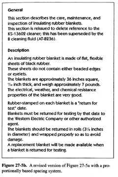
27.1.10.1 Vertical Spacing. The spacing of a page can be considered from both a vertical and a horizontal point of view. Let us consider vertical spacing first. The argument here is that the underlying structure -if complex text can be made more apparent to the reader by the consistent and planned use of vertical spacing. In practice, this means that predetermined increments of line space can be used consistently to separate out such components of the text as sentences, paragraphs, and sub- and major headings. One simple way of using line space in this way is to use it in a proportional system. One cart, for example, separate paragraphs by one line space; separate subheadings from paragraphs by two extra fines above and one below; and one can separate main headings from text by four extra lines above and two below. With more complex text, one can even start each sentence on a new line within each paragraph. What is the effect of such an approach? Figure 27-5a shows a traditionally spaced piece of text, and Figure 27-5b shows a revised version using the system described above. Such a proportional system is an effective way of determining that the amount of space between the component parts of a piece of text is consistent throughout the work. Other systems (not proportional, but equally consistent) can be used. Indeed, for even more complex text, one might wish to introduce indentation into the text to convey further substructure. Research has shown that readers usually prefer lengthy paragraphs to be set in a more open manner (e.g., see Hartley, Trueman & Burnhill, 1980). Readers thus generally prefer text set in the style of Figure 27-5b to that of Figure 27-5a. Finally, in this section on spacing the text, we should note that if the vertical spacing between the components of the text is to be consistent throughout the text, then this leads to the idea that the text will have what is called a floating baseline. This means that, in contrast to the method used in this handbook, the text does not stop at the same place on every page, irrespective of its content. With a floating baseline, the stopping point on each page is determined by the content and the structure of the text rather than by the need to fill the page.
As a rule of thumb, we can say that each page of the text should have a specified number of lines, plus or minus two. This flexibility allows the designer to accommodate "widows" and "orphans" - where a page starts with the last line of a previous paragraph or ends with a heading or the first line of a new paragraph-without changing the underlying spacing of the text. In traditional settings, as in this chapter, the internal spacing is sometimes stretched or squeezed to force the text to finish at the same point on each page. Normally this has little effect in pages of continuous prose, but, Hartley (199 1) provided an illustration of where such a policy could mislead the reader. 27-1.10.2. Horizontal Spacing. One can consider the horizontal spacing of text in much the same way as we have considered the vertical spacing. That is to say we can also look to see how we can use the horizontal spacing to separate and to group components of the text, and how we can vary the stopping point of horizontal text in accord with its content, rather than using arbitrary rules about line lengths. In this handbook, all the lines of text are set "justified." This means that all of the lines within the columns are of equal width, and that the columns have straight left- and right-hand edges. These straight edges are achieved by varying the, spacing between the words on each line and, Occasionally, by hyphenating or breaking words at the ends of the lines. Indeed, in text that has very narrow columns (e.g., in newspapers or advertising copy), the spaces between the letters forming the words are also often varied in order to force the text to fit a given length of line. A different approach to setting the text is to provide a consistent space between each word. Such a procedure produces "unjustified" text, i.e., the same amount of space between each word, and usually no word breaks (or hyphenation) at the ends of lines. Consequently, the text has a ragged right-hand edge. There has been much debate over the relative merits of justified and unjustified text. Muncer et al. (1986) and Misanchuk (1992) provide representative reviews, and Kinross (1994) provides an interesting historical footnote. It would appear . that it does not matter much which setting is used as far as understanding conventional text is concerned: The decision concerning which format to use is largely a matter of choice. There is some evidence, however, that unjustified text might be more helpful for less-able readers, be they younger children or older adults (see Hartley, 1994b). Nonetheless, it is doubtful whether the studies reviewed by Muncer et al. and by Misanchuk fully considered all of the possible advantages of unjustified text. One clear advantage is that one does not have to fill up each line with text; one can consider (as with vertical spacing) where best to end each line. With unjustified text, for instance, it is possible to specify that no line should end with the first word of a new sentence, or that if the last word on a line is preceded by a punctuation mark, then this last word should be carried over to the next line. And, of course, it is possible to consider the starting points of each line too. Figure 27-6a shows a piece of justified text; Figure 27-6b shows what happens to this text when space is used to show the underlying structure of the text. Research has shown that readers often recall more from text set in the manner shown in Figure 27-6b than they do from text set in the manner of Figure 27-6a (see Jandreau & Bever, 1992, for a review of this literature). And, curiously enough, when asked to write out their recalls of short texts set in these different formats, most readers write them out in the formats they are presented with (Hartley, 1993b). 27.1.10.3. Combining Vertical and Horizontal Spacing. So far I have discussed vertical and horizontal spacing as though they are separate issues-which, of course, they are not.
For all texts, interrelated decisions need to be taken which depend on the nature of the text. If the text consists of nothing but continuous prose, then (on a smallish page) a single-column structure with normal paragraph indentation may be perfectly acceptable. If, however, the text consists of numerous small elements, many of which start on new lines, then using traditional indentation to denote new paragraphs can be misleading. It is for reasons such as these that I gener-ally advocate the use of line spacing rather than indentation to denote the start of new paragraphs in instructional text (Hartley, Burnhill & Davies, 1972). If the text contains a mixture of text, diagrams, instruc-tions, and other typical material, then one has to think much harder about the appropriate way of presenting it. The key point here, of course, is that instructional text should not be designed on a "let's put this here" basis for every page. Decisions concerning the vertical and the horizontal spacing of the full text have to be made in advance of keyboarding it, and these decisions have to be adhered to throughout. Many designers advocate using what is called a "typograph-ical reference grid" in this respect (e.g. see Crouwel, 1979; Hartley, 1994a; Miles, 1987; Swann, 1989.) Using such a procedure-in which spacing decisions are mapped out in terms of grid modules-leads to a regular and consistent layout that will not confuse the reader. |
||||||||||||||||||||||
|
|
|
|
AECT 877.677.AECT
(toll-free) |
|
 )
as the "world format." In 1922, the German standard, DIN 476, was published.
For this standard, the ratio of width:height as
)
as the "world format." In 1922, the German standard, DIN 476, was published.
For this standard, the ratio of width:height as